Trend Viewer
The Trend Viewer plots one metric over time for up to 5 stations. Use it to see long-term trends in production, performance, downtime and energy, and to compare stations or periods before and after a change.
Using the Trend Viewer
Open Analysis Toolkit > Trend Viewer.
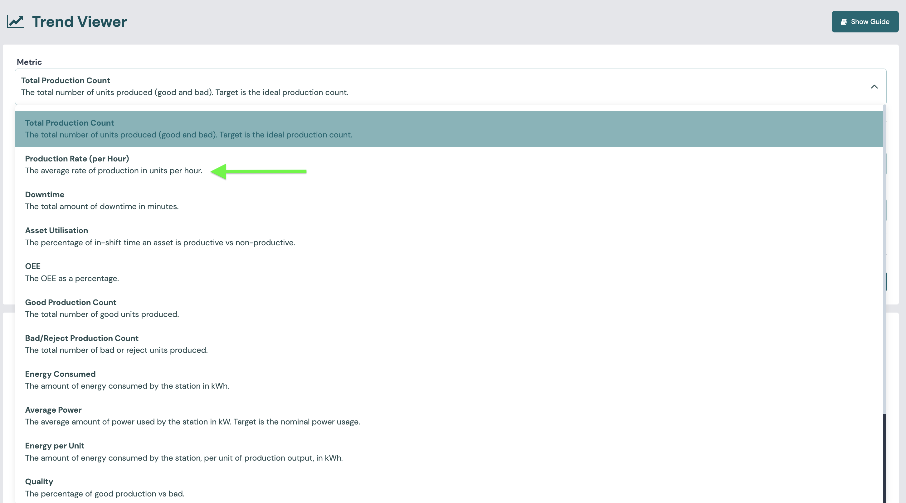
- Choose a Metric. Metrics are grouped into Production, Performance, Downtime and Energy. The table below lists all 15.
- For Downtime by Reason and Non-Production by Reason, also choose a Reason.
- Choose the Station Group and up to 5 Stations.
- Choose the Range Type (day, week, month, quarter, relative or custom) and the Range. You can also limit the chart to one Shift Name. Shifts are named in Shift patterns.
- Choose the Aggregation Duration. This is the length of each point or bar.
- Choose Combine Values: one line per station, or all stations combined into one series.
- Select Submit.
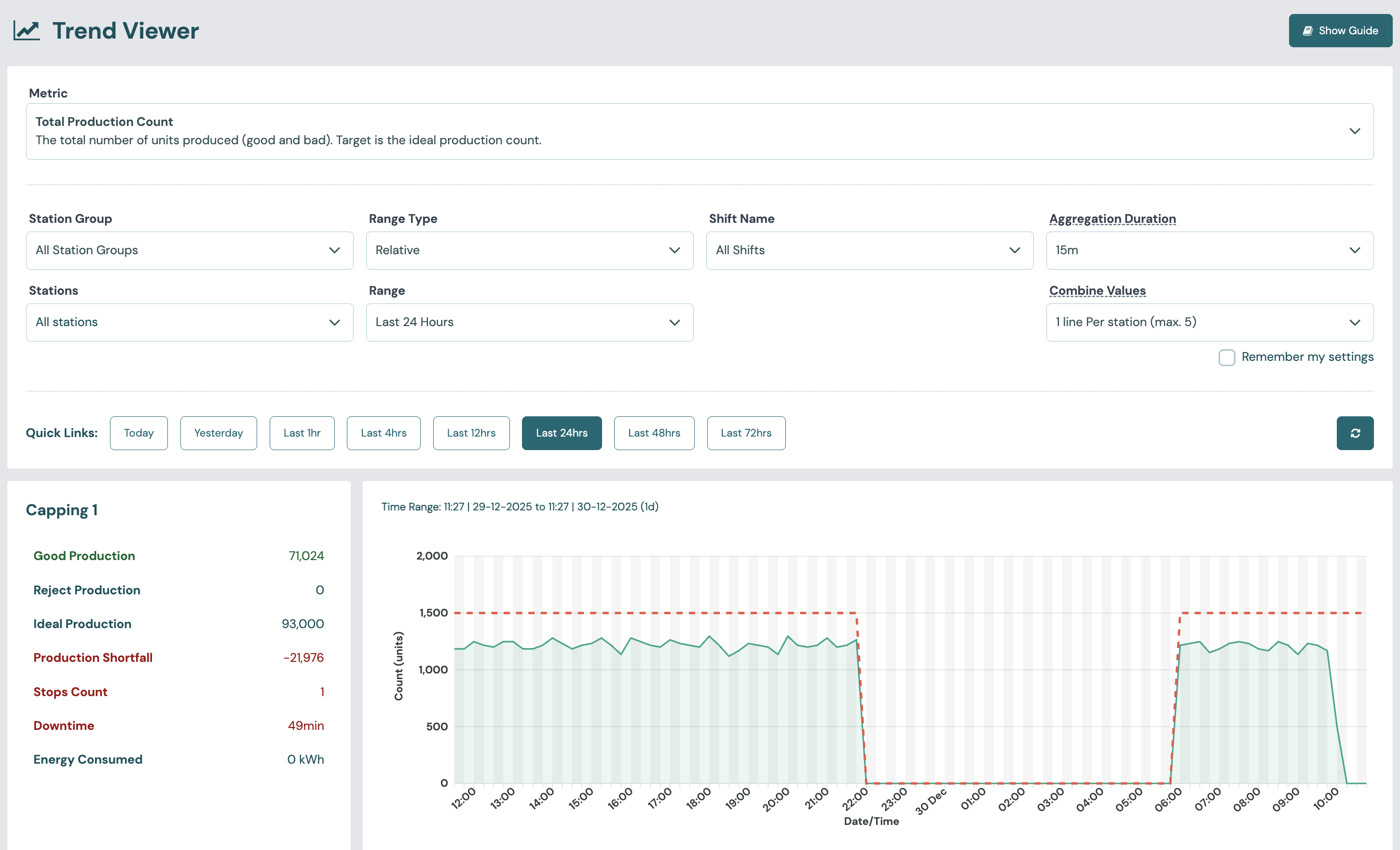
Quantities (unit counts, minutes and energy) are drawn as bars, one for each aggregation period. Rates and percentages (units per hour, power and OEE) are drawn as lines. Some metrics also show a dashed line for a target or an average. The table below says which.
Hover over the chart to see the value for each period. The table under the chart shows the same data, with a totals row (a sum or an average, depending on the metric). You can download it as CSV.
Station summary
Each station has a summary card next to its chart:
- Good Production and Reject Production: Good count and Bad count in the range.
- Ideal Production: Target count.
- Production Shortfall: Ideal Production minus actual production. A positive number (red) means the station is behind target. A negative number (green, shown with "+") means it made more than the target.
- Stops Count: Stops.
- Downtime: Total downtime.
- OEE and Utilisation: OEE and Utilisation for the range.
When the metric is Asset Utilisation, the card shows Considered Time (in-shift time minus scheduled non-production time), Productive Time and Utilisation instead.
Metrics available
| Metric | Group | Unit | Drawn as | Dashed line | Capability metric |
|---|---|---|---|---|---|
| Total Production Count | Production | units | bars | Target (ideal production count) | Production count, with Target count |
| Good Production Count | Production | units | bars | Good count | |
| Bad/Reject Production Count | Production | units | bars | Bad count | |
| Production Rate (per Hour) | Production | units/h | line | Target (ideal rate) | Production rate |
| OEE | Performance | % | line | Average for the range | OEE |
| Quality | Performance | % | line | Quality rate | |
| Asset Utilisation | Performance | min | bars | Target (scheduled production time) | Productive time |
| Total Downtime | Downtime | min | bars | Total downtime | |
| Downtime by Reason | Downtime | min | bars | Downtime by reason | |
| Non-Production by Reason | Downtime | min | bars | Scheduled non-production time, by reason | |
| Energy Consumed | Energy | kWh | bars | Energy consumed | |
| Average Power | Energy | kW | line | Target (nominal power, while a production schedule runs) | Average power |
| Energy per Unit | Energy | kWh/unit | line | Energy per unit | |
| Wasted Energy | Energy | kWh | bars | Wasted energy | |
| Power Usage vs Nominal | Energy | % | line | Power vs nominal |
Note
The Trend metric called Asset Utilisation plots Productive time in minutes, not the Utilisation percentage. The percentage is on the station summary card.
Capabilities and metrics
The Trend Viewer serves Production Tracking, Quality, OEE, Asset Utilisation, Downtime, Scheduling and Energy Efficiency. The table above links each metric to its definition.