Pulse Chart
The Pulse Chart shows one row of coloured blocks for each station, with one block for each time window. Use it to spot patterns within a shift: when stations stop, run outside their schedule, sit idle or use energy when nothing is planned.
Using the Pulse Chart
Open Analysis Toolkit > Pulse Chart.
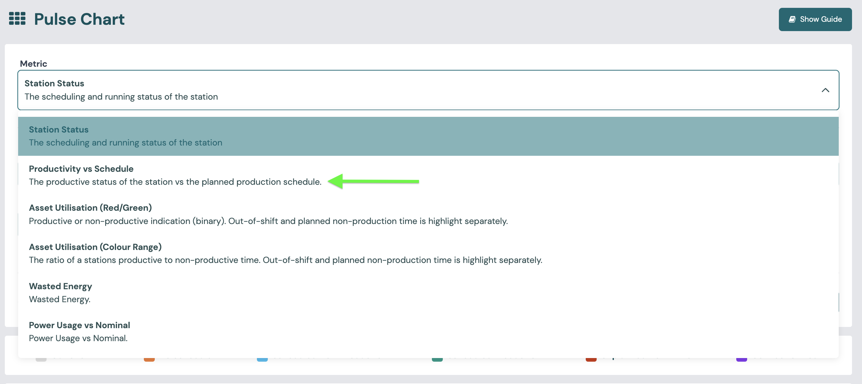
- Choose a Metric. Metrics are grouped into Schedule, Utilisation and Energy. The table below lists them.
- Choose the Station Group and Stations. You can select more than one station.
- Choose the Range Type (day, week, month or relative) and the Range. You can also limit the chart to one Shift Name.
- Choose the Aggregation Duration. This is the length of each block. A shorter duration gives more detail.
Stations are shown in rows, grouped by station group. Some metrics show a total at the end of each row, such as the total downtime or the utilisation over the range.
Read the key above the chart before you read the blocks. It explains the colours for the metric you selected, and the colours are different for each metric.
Hover over a block to see the details for that window. Click a block to open the same details in a larger panel.
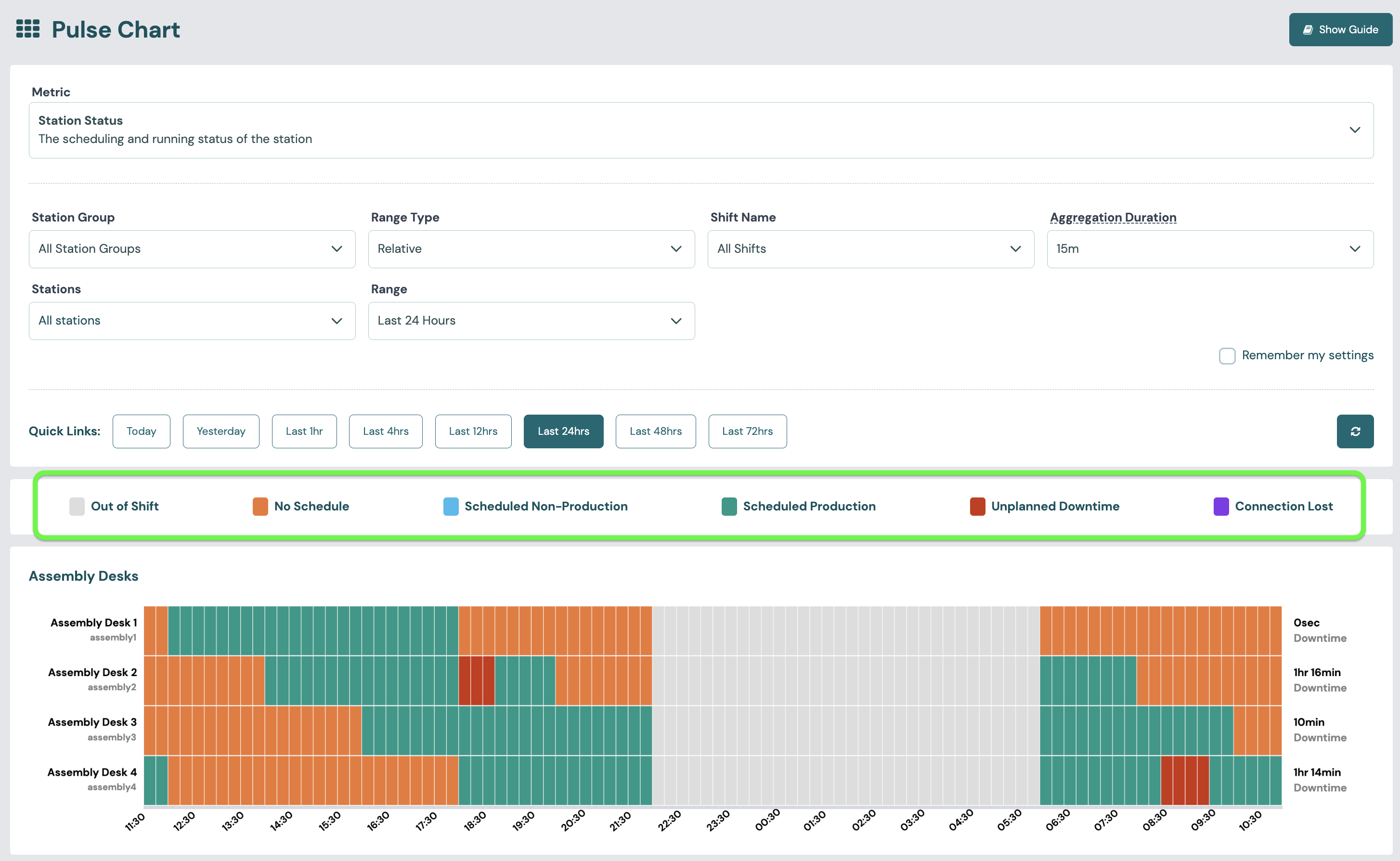
Schedules give each window its context. You create production and non-production schedules on the Gantt & Schedules pages, not on the Pulse Chart.
Metrics available
| Metric | What the blocks show | Legend | Row total |
|---|---|---|---|
| Station Status | The scheduling and running status of the station in each window. A window shows Unplanned Downtime when downtime covers at least half of it. Connection Lost is shown only when the station is in shift, not in downtime and not in planned non-production. See Scheduled production time, Scheduled non-production time and Total downtime. | Scheduled Production, Unplanned Downtime, Planned Non-Production, No Schedule, Connection Lost, Out of Shift, and future versions of these (for example Scheduled Production (Future)) | Downtime |
| Productivity vs Schedule | Productivity vs schedule: whether the station was productive, compared with whether a production schedule was running. | Productive, Not Productive, Not Scheduled, Unexpectedly Productive (Outside Schedule), Out of Shift, Out of Shift (Future), In Shift (Future) | None |
| Asset Utilisation (Red/Green) | Productive state: green if the station was productive in the window, red if it was not. | Utilised, Stopped, Out of Shift, Future Time, Planned Non-Production, Connection Lost | Utilisation |
| Asset Utilisation (Colour Range) | The share of each window in which the station was productive, on a scale from red (0%) through yellow to green (100%). The tooltip shows "Utilised: n%". | Stopped, Utilised 25%, 50%, 75% and 100%, Out of Shift, Future Time, Planned Non-Production, Connection Lost | Utilisation |
| Wasted Energy | Wasted energy: red when the station used energy in a window with no production or non-production schedule. | Wasted Energy, Productive Energy, Out of Shift | Wasted energy (kWh) |
| Power Usage vs Nominal | Power vs nominal in each window. Overload means 200% of nominal power or more. If the station has no nominal power set, every in-shift window shows as Idle. | Nominal Load, Idle, Overload, Out of Shift | None |
Note
On the Pulse Chart, out-of-shift windows are shown in grey and are not yet added to the Wasted Energy total. The Trend Viewer includes them, so its Wasted Energy figure can be higher for the same range.
Nominal power is set for each station in Station admin.
Capabilities and metrics
The Pulse Chart serves these capabilities:
- Asset Utilisation: Productive state, Utilisation.
- Scheduling: Productivity vs schedule.
- Downtime: Total downtime (in Station Status).
- Energy Efficiency: Wasted energy, Power vs nominal.
FAQs
What does purple mean in the heatmap?
Purple means Connection Lost: Busroot received no signals from the station in that window. This can happen in short blips, for example when the Wi-Fi drops for a moment. It can also mean the machine was switched off, so the Busroot hardware had no power to send signals.
If a station shows purple often, check its network connection. See Shop floor network.